Monday, 7 December 2015

9.2 Histograms homework


Quite a few people failed to READ THE QUESTION (rookie mistake) and forgot to actually construct the histogram.

This question had a bit of a puzzle in it.  What are the boundaries of the groups?  Most people decided to use the end of the group.  You should think about how the numbers would have been rounded.
I guessed the groups should be extended by 0.5 of a km each way.  Why do you think that is?

Otherwise nearly everyone calculated the group widths as 2.  This would mean they are not connected and so it wouldn't be a histogram (which many of you wouldn't know as you didn't complete the histogram)

Another important thing to note is that this is not like a bar chart because the x axis is a scale rather than set of categories.  Numbers should be evenly spaced and the groups set based on the scale not the axis set based on the groups.


For this question the main problem was forgetting about frequency density and plotting these with frequency instead (and writing 3 in the table for 1000 < w < 1400 instead of 6)


Saturday, 5 December 2015

9.2 Infographic homework

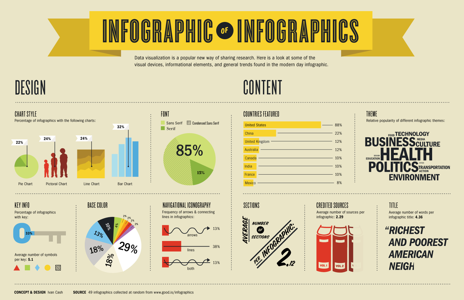
The purpose of this homework was to use some of the data presentation types we had learnt about in a real context.  Infographics are widely used nowadays and often contain pie charts and bar charts as well as more exotic kinds of graphs.

Homework submitted was varied. 
Examples of charts and graphs
Some just gave examples of charts with explanations. I assume this is because they were not sure what an infographic was.  It would be good to do at least a quick search for infographics or ask if there is any confusion over the task in future.

Obesity infographics
It was great to see that some had jumped on a relevant topic for the school at present.  That is a perfect example of what I was looking for and how data can be used.


Same data for multiple charts
Infographics use different charts for different information.  You would usually need more than one set of data to start to tell the story about a topic.  You wouldn't use different charts to show the same data.

Personal topics
Many chose to explore topics of their personal interest.  I thought some of these were just fantastic and I was particularly impressed by the amount of work that must have gone into some of them

Here were some (not all) of the best imho.


Sunday, 29 November 2015

10_4 Homework

Homework - due Friday 4 Dec
The idea of this homework was to explore how equations can be manipulated while still maintaining balance.  Some excellent examples of the homework below.


Some of the issues that came up in this homework was:
  • Not checking work - You should check that the equation is actually equal.
  • Subtracting or adding numbers that were multiplied to other numbers
  • Dividing by numbers when there are more than one term on that side of the equation
Homework not yet received from:
 Rochelle


Create your own example of the web above, either using the equation:

25 - 4 x 3 = 13 

or come up with your own equation.  Show at least 5 different ways to represent the relationship between the numbers.


 Examples of the homework showing working and useful ways of thinking about the technique


 We all make mistakes.  It's essential to learning.  It's good to show the mistakes and how you corrected them.


20 November - due Wednesday 25th
Solving Equations

Tuesday, 24 November 2015

9.2 Bar Charts

Exemplar Work from class on bar charts
Don't forget titles and labels though!


Monday, 23 November 2015

9.2 Homework

4 January - due 11 January

Worksheet from mathswatch - Scatter Graphs clip 87


30 November - due 7 December
Histograms Worksheet
All homework received.  Thank you.
 

23 November - due 30 November
No homework yet received from the following students:
Ellie,  Fiona,  Annu

Produce an infographic
Choose a topic of your choice that has some statistics or numerical information.
Produce:
  1. a dual or composite bar chart
  2. a pie chart (comparative pie chart if you are adventurous!)
  3. one other form of visual data representation (pictograms, bubble charts, stem and leaf, something else new)
  4. a title
  5. an appropriate image
  6. a small piece of written text about the topic
You can complete this in your book, on paper or electronically. Research the term infographic and look at a few examples before beginning.

Monday, 16 November 2015

9.2 Grouped Data Homework


Comments on grouped data homework - submitted 14 Nov
Feel free to leave comments here about the homework and how it can be improved


Well set out

What would a sensible value for the mean be?

Why is 45,450 unlikely to be the mean?


Very good example of how to set out work clearly...
...but there are a few problems

Where are the errors?
Why do you think it has been ticked?
What do you think about the size of the groups?

How would we know this was a mistake?

What could you do in this case?

It can be difficult to check all of the numbers that you've tallied.  How could you make it easier to check them?

Colour coding?  More strict methods of tallying?  What else?


Is the mean 178.08?
Start with good intentions...

 A mean of 5.92 miles??
And it's ticked
A lot of effort has gone in to this homework plus evidence of checking and a sensible mean with the calculation shown.

Very clear.  An excellent example of a piece of homework!